As far back as the 8th century the geometry underlying the creation of letters became a principle. So the idea to draw the letter from its screen environment and not from the physical surface of the design sheet or the printed page and to draw by displaying fonts on screen is a technical culture. In the first half of the 20th century, many designers worked on the construction of modular typefaces, in which geometric parts and an underlying grid formed the letter shapes. Besides the grid basis, however, FRAC followed more the principle of early CAD fonts. These coordinates-based fonts with simple onestroke lines were used for factual labelling of 3D and architectural drawings.
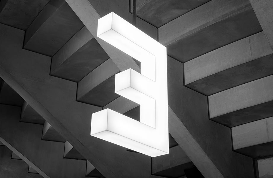
FRAC is a simple geometric capital font based on a grid of seven by seven dots. The dot connections are solved only with straight lines, the angles are sharp-edged and the open ends abruptly cut. The focus was on using as few connections as possible with the greatest possible independence and recognisability of the letters. The increase in boldness is subject to the ratio of the halving of the size of the relative weight, rendered based on the same skeleton.
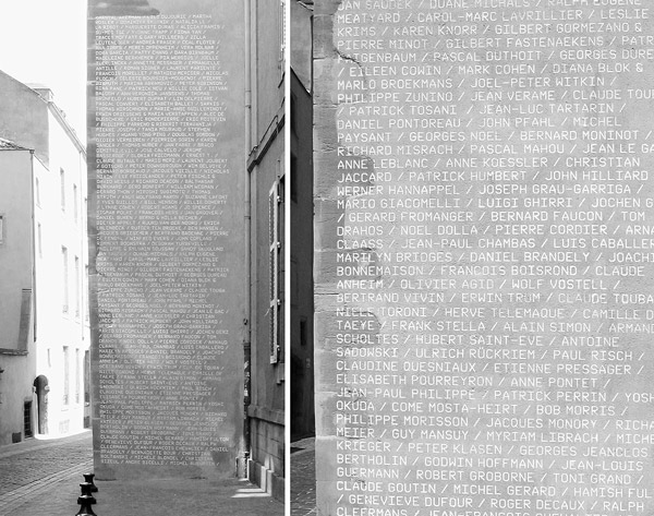
The design of the typeface dates back to 2003. The Contemporary Art Foundation in Metz in the French Lorraine commissioned a visual identity for its new location. Nik Thoenen and Maia Gusberti (re-p.org) developed the strong simplification in the formal language of the typeface as a concept to contrast with the historical, partly medieval building fabric of the museum in Metz.